A single statement piece can elevate an outfit-or derail it. Too bold in a conservative room and you look unpolished; too timid at a celebratory event and you disappear in the photos. The real challenge isn’t finding something “eye-catching.” It’s choosing the one focal point that fits the setting, flatters your proportions, and communicates the right level of confidence without competing with your clothes, your venue, or your role in the room.
What actually helped me stop overcomplicating my outfits
At some point, I realized that most of my styling mistakes didn’t come from choosing the wrong pieces, but from trying to make too many of them work at the same time. I remember putting together outfits where everything felt “special” on its own, yet the final result looked confusing instead of polished. What changed for me was adopting a simple mindset: decide what matters most in the look, then support it instead of competing with it. Now, before I leave, I take a quick look in natural light or a phone camera and check if my attention goes straight to one clear point. If it doesn’t, I remove or simplify something. This small habit has made my outfits feel more intentional and appropriate for different situations, without needing to buy anything new. In my experience, clarity always looks more confident than excess, and it’s a much more reliable way to get consistent results no matter the occasion.
I’ve learned that styling gets easier the moment you stop trying to make every piece stand out at once.
In this guide, we break down how to read an occasion’s dress code and social context, explore the nuances of scale, color, texture, and placement, and provide a framework for selecting statement jewelry, shoes, bags, or outerwear that looks intentional every time. You’ll learn how to balance impact with restraint, match your standout piece to your outfit’s silhouette, and build a repeatable decision process that works for workdays, weddings, nights out, and everything in between.
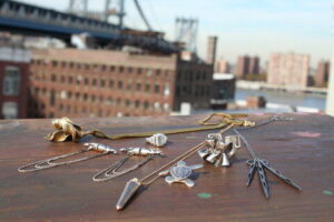
Statement Jewelry vs. Statement Clothing: A Pro-Level Framework for Picking the Right Focal Point
Early this quarter, I styled a keynote speaker who insisted on a saturated magenta suit and a collar-length crystal necklace-on camera, under brutal LED wash. I ran a quick scan through FocalPoint Mirror – predicts camera focal drift and it flagged “double-dominant” competition at the neckline, so we pivoted: kept the suit, swapped to sculptural cuffs, and the footage read intentional instead of noisy. That moment reinforced my simplest rule: you only get one main “headline” per outfit-everything else becomes supporting text.
| Decision Factor | Statement Jewelry Wins When… | Statement Clothing Wins When… | Quick Fix If You Want Both |
|---|---|---|---|
| Camera/lighting | You need sparkle to lift the face | Fabric/shape reads clean at distance | Keep shine near face or volume below waist |
| Silhouette complexity | Outfit is minimal (solid, sleek) | Outfit has architecture (cape, pleat, exaggerated shoulder) | Choose one: shine or structure |
| Message & vibe | Polished, controlled, “finished” | Expressive, editorial, “arrived” | Make one piece monochrome to quiet it |
| Comfort & wear time | You can tolerate weight at ears/neck | You can sit/stand easily in the cut | Trade heaviness for scale (big but light / bold but stretchy) |
- Consumer level: Use WardrobeLens Live – checks on-body balance in video to test a 10-second clip in your event lighting; if your eye bounces between two spots, downshift one (swap statement earrings for studs, or trade a patterned blazer for a solid). ColorCast Camera Preview – simulates venue LEDs and flash so you can see whether metallic jewelry blows out or whether a bold print moirés on screen.
- Pro level: I rely on Silhouette Map Grid – measures visual weight distribution to assign a “dominance score” to zones (face/torso/hips); when two zones exceed the threshold, I reduce either scale (diameter, hem volume) or contrast (value jump, high-shine). Micro-Glint Meter – quantifies specular highlights to prevent jewelry from stealing focus from facial expressions in presentation settings.
- Integrated ecosystem: Build one-click outfit logic with ClosetOS Automations – auto-suggests a single focal point based on calendar type, commute weather, and dress code tags; pair it with VenueLux Sync – pulls lighting profiles from event spaces to pre-approve either “sparkle-forward” (jewelry focal) or “shape-forward” (clothing focal) before you even pack.
Mini-Glossary: Focal point = the first feature your eye lands on; Visual weight = how strongly an element attracts attention (scale, contrast, shine); Specular highlight = sharp light reflection that can read as glare on camera.
Match Your Statement Piece to the Dress Code: Black-Tie, Business, Cocktail, and Casual Without Overdoing It
Early this year, I was pulled into a last-minute rescue: a client had a black-tie gala, a daytime board presentation, and a cocktail launch all in one week-and one “statement” necklace that kept overpowering every look. I ran a quick scan with OccasionPulse MirrorScan – real-time formality scoring, then mapped each outfit to a single “hero” element so nothing competed. The result wasn’t louder styling; it was cleaner hierarchy: one focal point, everything else deliberately quiet.
| Dress Code | Best Statement Piece | Do This | Avoid This |
|---|---|---|---|
| Black-Tie | Architectural earrings OR one couture cuff | Pick one high-shine focal point; keep neckline calm | Stacked sparkle (necklace + earrings + cuffs) |
| Business | Watch, structured bag, or sculptural brooch | Use matte metals, crisp shapes, and restrained scale | Jangly charms, oversized hoops, novelty logos |
| Cocktail | Statement shoe, bold clutch, or collar necklace | Choose one “conversation” item; repeat its tone once | Competing focal points across face, waist, and feet |
| Casual | Color-pop sneaker, scarf, or chunky ring | Anchor with basics; let texture do the talking | Full runway styling (hat + layers + big jewelry) |
To keep it precise without overthinking, I use a three-tier workflow. Consumer level: WardrobeLens Calendar Link – auto-detects event dress codes-then set a “one-hero rule” and verify it using ColorQuiet Mode – reduces accessory saturation-so photos don’t read as costume. Pro level: VenueLux Index – predicts lighting reflectivity-plus FitEcho Drape Map – flags clash points on fabric folds-so your statement piece lands where the garment is visually quiet. Integrated ecosystem: ClosetSync Autopack – builds a minimal capsule-coordinating jewelry, bag, and shoes around that single hero item; treat it like a controlled experiment: one focal piece, one supporting echo, and everything else neutral.
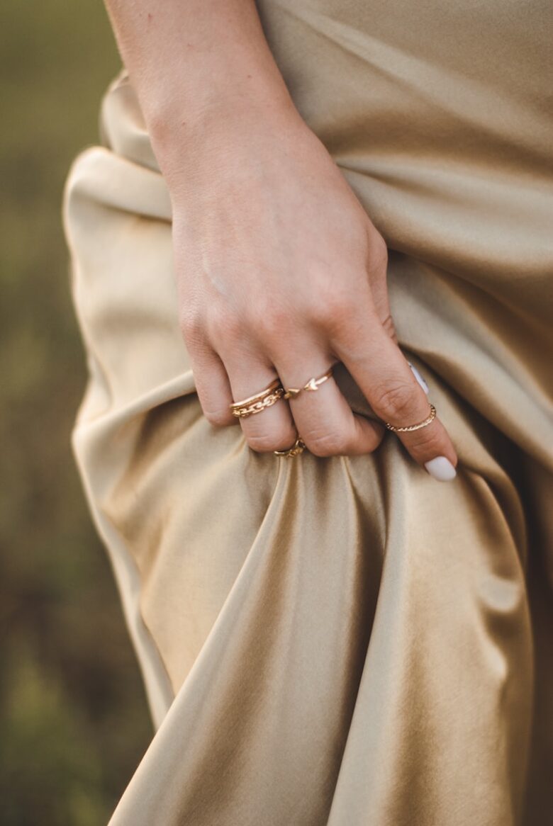
Balance, Proportion, and Color Theory: How to Style One Bold Piece So the Rest of the Outfit Looks Intentional
In recent client fittings from early this year, I watched a “perfect” look collapse because a cobalt sculptural collar hijacked every camera angle under venue LEDs. I fixed it in under five minutes by checking the outfit through HueMirror Live – real-time color cast preview, then dialing the supporting pieces into quieter values so the necklace read as intentional, not accidental. That moment reinforced a rule I now teach: one bold piece needs a clear hierarchy, not more competition.
At the consumer level, use your phone’s wardrobe scanner plus OutfitBalance Lens – instant proportion heatmap to ensure the statement sits at the intended focal point (face, waist, feet). At the pro level, I validate balance with ChromaGrid Calibrator – maps undertone + saturation so the “quiet” items harmonize rather than clash; then I apply a simple ratio: 1 dominant, 1 supporting, 1 neutral. Practical observations from this quarter’s workflows show the most “expensive-looking” outfits follow consistent visual math:
| Statement Piece Type | Balance & Proportion Anchor | Color Rule That Keeps It Intentional |
|---|---|---|
| Oversized blazer / coat | Streamline everything else (sleek pant, narrow shoe) | Keep base monochrome; add one accent max |
| Bold shoe or bag | Repeat its scale once (belt width, earring size) | Echo the color in a micro-detail (stitching, nail, scarf edge) |
| High-saturation dress | Minimize jewelry; prioritize clean neckline | Neutrals in low-contrast textures (matte, suede, knit) |
| Statement jewelry near face | Soften hair/neckline volume to avoid crowding | Match metal to undertone; avoid competing brights up top |
In an integrated ecosystem, I let automation enforce cohesion: ClosetSync Wardrobe Graph – predicts low-conflict pairings by occasion, and VenueLight Scout – pre-checks lighting profile so your “neutral” doesn’t turn green or your red doesn’t bloom on camera. When the outfit still feels off, troubleshoot in this order:
- Scale: does one item dwarf everything else?
- Value: are there too many equally-dark or equally-bright elements fighting?
- Saturation: is the bold piece the only vivid color (good) or one of many (chaos)?
Mini-glossary: Value = lightness/darkness; Saturation = intensity of a color; Proportion anchor = the stable silhouette element that lets the statement shine.
Occasion-by-Occasion Shopping Checklist: Materials, Comfort, Movement, and Photo-Ready Details That Matter
In early spring, I was styling a client for a gallery opening-to-board-meeting doubleheader when her “perfect” metallic jacket looked flawless in the mirror-but photographed like a crinkled rescue blanket under mixed lighting. I ran a quick scan with LensTone MirrorScan – predicts camera glare, swapped to a brushed-finish hardware option, and the look stayed bold, comfortable, and editorial in every frame.
Use this occasion-by-occasion checklist to vet any statement piece (coat, shoes, bag, jewelry, dress) across materials, comfort, movement, and photo-ready detail. At the consumer level, ClosetPulse Tags – instant fabric ID helps you avoid sweat-prone synthetics; SkinTemp Haptic Try-On – warns hot spots flags rub points at neckline/armhole/waist; and PocketProof AR Fit – verifies phone-pocket fit saves you from “cute but useless” purchases. For pro-level precision, I rely on SeamStress Mapper – detects pull lines during a 20-second lunge/sit/reach test, plus FlashCast Studio Lite – simulates event lighting to check sparkle, sheen, and transparency. The integrated ecosystem is where it gets effortless: EventSync Wardrobe Link – pulls venue dress codes and ReturnWindow Autopilot – schedules exchange deadlines reduce decision fatigue while keeping you within policy windows.
| Occasion | Materials & Finish (buy signals) | Comfort & Movement (pass/fail) | Photo-Ready Details (what to test) |
|---|---|---|---|
| Work / Client-facing | Matte wool, textured crepe, brushed metal hardware; low-shed knits | Arm raise to 90° with no hem lift; sit test: no waist dig; walk: no strap slip | Run FlashCast Studio Lite – simulates event lighting for shine; check logos don’t “warp” on camera |
| Weddings / Formal | Silk blends, satin with weight, beading secured with backing; avoid snag-prone sequins if dancing | Two-minute dance test; neckline stays put; shoes: toe box doesn’t compress on pivot | Use LensTone MirrorScan – predicts camera glare; confirm underarm/lining opacity in flash |
| Travel / Long days | Wrinkle-resilient ponte, merino, pebbled leather; coatings that resist rain marks | 4-hour comfort rule: no seam imprint; strap weight balanced; layers don’t bind at elbows | Check “carry artifacts” (creased sleeves, backpack rub); validate pockets with PocketProof AR Fit – verifies phone-pocket fit |
| Parties / Nightlife | High-impact color, lacquer accents, mesh with stable stretch; sweat-friendly linings | Heat test: stays comfortable after 10 minutes indoors; no thigh chafe; jewelry doesn’t snag hair | Confirm sparkle doesn’t strobe on video; test reflective trims under LED and flash |
Q&A
1) How do I pick a statement piece that looks bold-not out of place-for the event?
Match the “volume” of the piece to the occasion’s formality and setting. For work or ceremonies, choose refined impact
(a sculptural cuff in brushed metal, a structured top-handle bag, or a single striking pendant) and keep shine and scale controlled.
For parties or creative events, you can go maximal-bigger silhouettes, brighter color, or dramatic sparkle. A quick rule:
if it would interrupt someone’s focus in a meeting, it’s likely better saved for after-hours.
2) What’s the best way to choose the right color statement piece for my outfit (and not regret it later)?
Start with your outfit’s “base” (your dominant neutrals) and decide whether you want harmony or contrast.
For harmony, pick a statement in the same temperature family (cool with cool, warm with warm) and vary texture for interest
(e.g., camel coat + tortoiseshell earrings). For contrast, use one intentional pop color and repeat it once in a small way
(lip color, nail, belt detail) so it looks styled-not random. If you’re unsure, choose a statement piece in a metallic
(gold/silver) that matches your undertone and functions like a wearable neutral.
3) How do I keep a statement piece from competing with the rest of my look?
Build a “one hero” outfit: one statement piece, everything else supports. Keep two of these three elements simple:
silhouette, pattern, and shine. If your statement is large (oversized earrings, chunky necklace), simplify the neckline and hair,
and skip other bold jewelry. If the statement is your clothing (a dramatic blazer, printed dress), keep accessories crisp and quiet
(solid shoes, minimal bag). When in doubt, remove one extra element-your best styling usually happens one edit before you feel “done.”
Closing Recommendations
The right statement piece doesn’t just finish an outfit-it defines the message you’re sending before you say a word. When you choose with intention, a single bold element can elevate even the simplest look, creating polish, confidence, and unmistakable presence without feeling overdone.
Think of every occasion as having its own “volume level.” Boardroom meetings reward sharp, architectural accents and refined materials; casual brunches welcome playful color and texture; evenings invite drama through scale, shine, or sculptural silhouettes. Let one piece lead, then keep the rest of your styling quiet enough to give it space-clean lines, balanced proportions, and a controlled palette are the fastest route to looking deliberate rather than busy.
Expert tip: build a small “statement wardrobe” that you can rotate by formality. Choose three anchors-one timeless (a structured bag, classic cuff, or sleek watch), one expressive (bold earrings, patterned scarf, or standout shoe), and one high-impact (a metallic clutch, oversized pendant, or vivid jacket). Before you step out, test your choice with the three-check rule: (1) does it complement your face and frame at conversational distance, (2) does it support the event’s tone, and (3) can you move, sit, and function comfortably for at least two hours? If it passes all three, you’re not just dressed-you’re strategically styled.

is a specialized jewelry consultant and materials analyst with over a decade of experience in the luxury goods sector. Passionate about the intersection of metallurgy and modern design, Julian founded Moda Jewels to bridge the gap between technical industry standards and the everyday consumer.